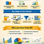
You have already learned the basics of importing data, cleaning it, and understanding the Power BI interface, now it is time to move to the next step. In this part of the tutorial (part-1 and part- 2), you will learn how to create simple visuals, build a basic dashboard, and make your reports more useful and professional.
For every beginner, this is one of the most exciting parts of learning Power BI. This is where your raw data starts turning into meaningful charts, reports, and business insights.
Step 6: Create Your First Visual in Power BI
Once your data is loaded into Power BI, you can begin creating visuals. On the right side of the screen, you will see the Visualizations pane. This section allows you to create different chart types such as:
- Bar chart
- Column chart
- Pie chart
- Line chart
- Table
- Card
- Map
To create a visual, simply select a chart type and drag your data fields into the values, axis, or legend sections.
For example, if you want to see total sales by month, you can choose a column chart, then drag the Month field to the axis and the Sales field to values.
This simple action helps you understand your data in a visual way instead of just looking at rows and columns.
Step 7: Use Filters to Make Reports More Useful
Filters are very important in Basic Power BI because they help users focus on specific information.
For example, you may want to:
- View sales for only one product
- Check data from a single region
- Analyze one year at a time
- Compare specific departments
Power BI allows you to apply filters at different levels. You can filter one visual, one page, or the entire report.
This makes your dashboard more interactive and easier to use. Instead of making multiple reports, you can create one smart report with flexible filters.
Step 8: Add Slicers for Easy Interaction
A slicer is one of the most useful tools in Power BI for beginners. It works like a clickable filter on your report page.
For example, you can add slicers for:
- Year
- Country
- Product category
- Department
- Employee name
When someone clicks a value in the slicer, all related visuals update automatically. This creates a more dynamic and professional dashboard experience.
If you want your report to look modern and user-friendly, slicers are a great feature to use.
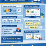
Step 9: Build a Simple Dashboard Layout
Now that you have some charts and slicers, the next step is organizing them properly on the report page.
A good Power BI dashboard should be:
- Clean
- Easy to read
- Visually balanced
- Focused on important information
Try placing your most important numbers at the top using card visuals. For example:
- Total sales
- Total profit
- Total customers
- Total orders
Below that, place charts that show trends, comparisons, or performance details.
Do not overload the page with too many visuals. Beginners often make the mistake of adding too much. A simple dashboard usually works better than a crowded one.
Step 10: Format Your Report for a Professional Look
Formatting is what makes your Power BI report look polished and professional.
You can improve your report by:
- Changing chart colors
- Adjusting titles
- Editing background and borders
- Aligning visuals neatly
- Using readable fonts
- Adding data labels
A neat design makes your report easier to understand. It also gives a stronger impression if you are showing it to clients, managers, or team members.
Even with basic skills, a well-formatted report can look impressive.
Step 11: Save and Publish Your Power BI Report
After creating your report, do not forget to save your Power BI file. Power BI Desktop files are usually saved as .pbix files.
If you want to share your report online, you can publish it to the Power BI Service. This allows you to access reports from a browser and share them with others depending on your account type and permissions.
For beginners, saving your work properly and keeping organized file names is also an important habit.
Common Beginner Mistakes to Avoid
When learning Basic Power BI, many beginners face the same problems. Here are some common mistakes to avoid:
- Importing messy data without cleaning it
- Using too many visuals on one page
- Choosing the wrong chart type
- Forgetting to format titles and labels
- Ignoring filters and slicers
- Not checking if numbers are correct
Power BI becomes much easier when you focus on clarity, accuracy, and simple design.
Why Learning Basic Power BI Is Worth It
Power BI is not just a reporting tool. It is a powerful skill that can help students, freelancers, office workers, analysts, and business owners make smarter decisions.
With Basic Power BI, you can:
- Turn data into visual reports
- Track business performance
- Save time in reporting work
- Improve presentations
- Build a valuable career skill
That is why more people are searching for beginner-friendly Power BI tutorials and easy dashboard training.
Final Thoughts
Starting with Basic Power BI may seem difficult at first, but step by step, it becomes much easier. In this part, you learned how to create visuals, use filters and slicers, organize a dashboard, and format reports for a professional result.
The best way to learn is by practicing with real data. Start small, keep experimenting, and improve with each report you build.
Power BI is a practical skill that can create real value for your work, studies, or business. The more you practice, the more confident you will become.
Some of Power BI Dashboard and Ready to use
a) 150+ Power BI Dashboard Templates for Business

b) 80+ Power BI Dashboard Templates for Data Analytics, KPI Tracking & Business

c) 2000+ Ready Excel Files (.XLS)

d) 3500+ Editable Professional Excel Templates